Miss Saigon has to be one of my all-time favourite musicals. Written by the team behind Les Miserables, and first performed at the Theatre Royal, Drury Lane, Miss Saigon is a modern adaptation of Puccini's Madame Butterfly staged against the backdrop of the Vietnam War.
It looks like it's set to return to London's West End in 2013, and Cameron Mackintosh is already holding auditions out in Manilla, no doubt on a quest to find the new Kim, Gigi, Thuy and the ever-optimistic Engineer.
It will most likely appear with it's old livery and branding (with the brilliant face-in-a-helicopter brush work), but I allowed myself a couple of afternoons to dream. This is the result.
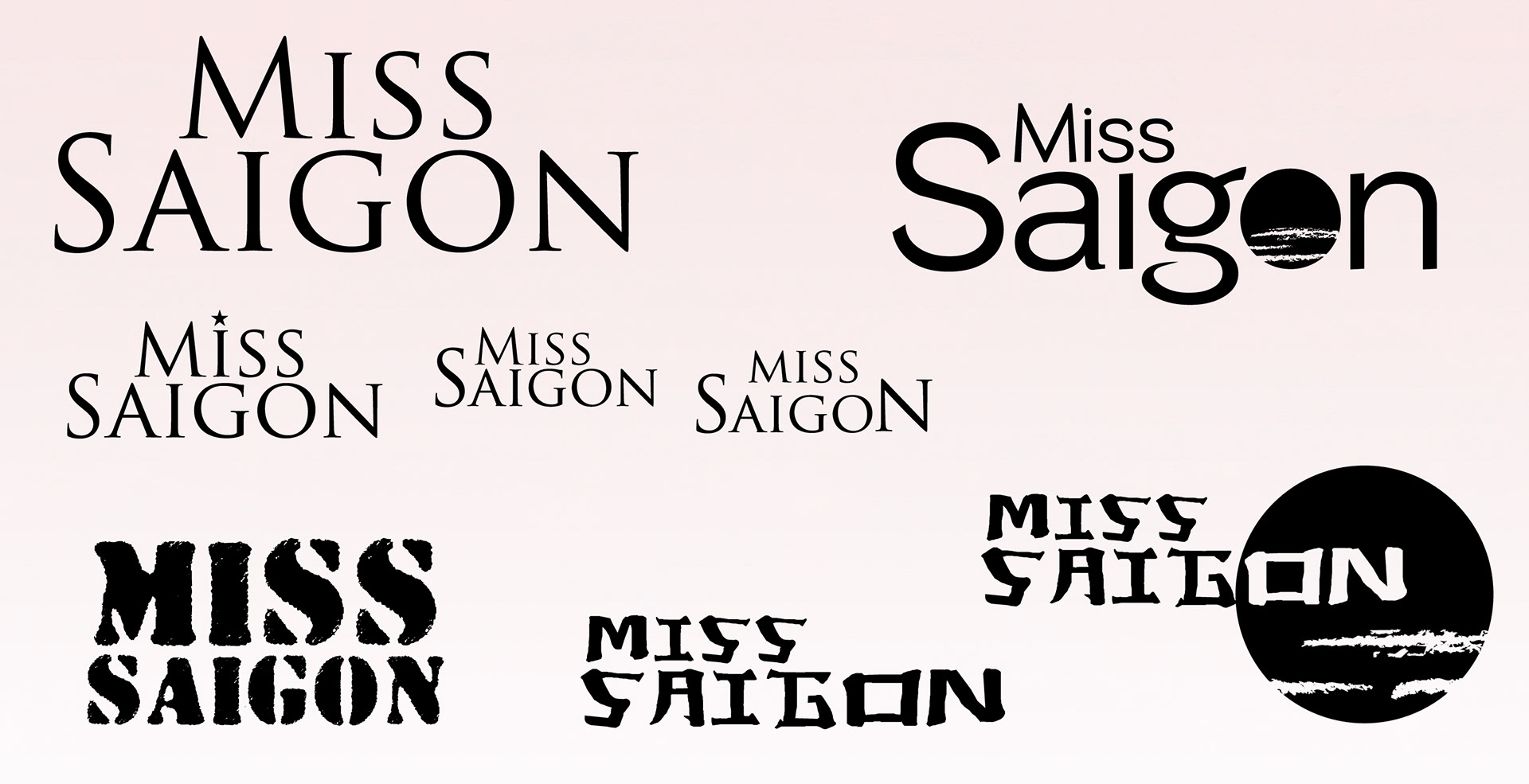
This is one stage on from my initial sketches. I prefer to work through typography directly on screen - it's much neater!
I wanted to capture some sense of grandeur, either in scale (with the cloud-covered sun), in elegance (with the almost-ubiquitous Trajan Pro), or with the might of the American Military.
I wanted to capture some sense of grandeur, either in scale (with the cloud-covered sun), in elegance (with the almost-ubiquitous Trajan Pro), or with the might of the American Military.
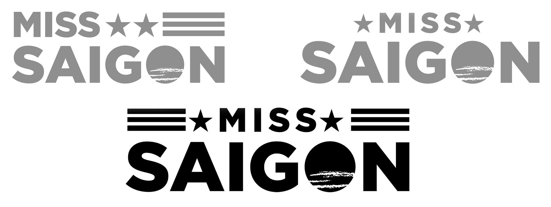
The joy of a concept project is that I am both designer and client. And I liked this concept - strong Gotham and stars and stripes - so I went with it!
Gotham will (in my mind at least) forever be linked with feelings of America. The 2008 & 2012 Obama elections design work established it's dominance, and I love it's original inspiration source - the geometric lettering featured in buildings such as New York's Port Authority in Battery Park, Manhattan.
Gotham will (in my mind at least) forever be linked with feelings of America. The 2008 & 2012 Obama elections design work established it's dominance, and I love it's original inspiration source - the geometric lettering featured in buildings such as New York's Port Authority in Battery Park, Manhattan.

The stars and stripes evoke the American military might, and with lots of focus on the soldiers and the post-war return to Vietnam by the lead male character, Chris, I wanted to take a strong lead from this. Stars and stripes appear geometrically in most American military emblems, designs and motifs, so I incorporated them within the brand.
The stars mimic the spacing on the letter E of Gotham, and the cloud-obscured sun fits in well due to the almost circular shape of the letter O.
The stars mimic the spacing on the letter E of Gotham, and the cloud-obscured sun fits in well due to the almost circular shape of the letter O.

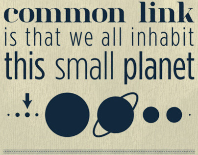
I wanted to get some bold statements out of the show. Picking words from the lyrics of some of the more prominent numbers seemed to give me endless possibilities. These are just six, but I wanted them to become anchors for the promotional material.
My initial thoughts were actually around 'The Heat is On!' being the title for the Andrew Lloyd Webber-fronted talent search show for the musical. Of course, with some of the more 'adult' themes of prostitution, sex, and (the always-heart-warming) war, I doubt a show like this would survive on a Saturday tea-time slot on BBC One!
My initial thoughts were actually around 'The Heat is On!' being the title for the Andrew Lloyd Webber-fronted talent search show for the musical. Of course, with some of the more 'adult' themes of prostitution, sex, and (the always-heart-warming) war, I doubt a show like this would survive on a Saturday tea-time slot on BBC One!
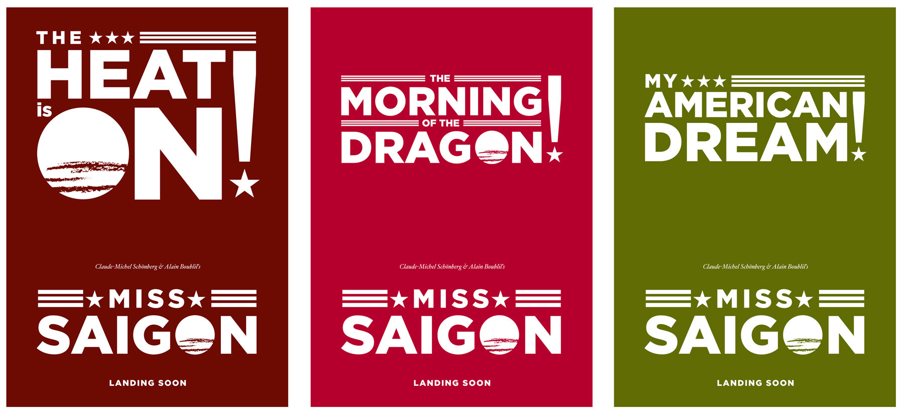
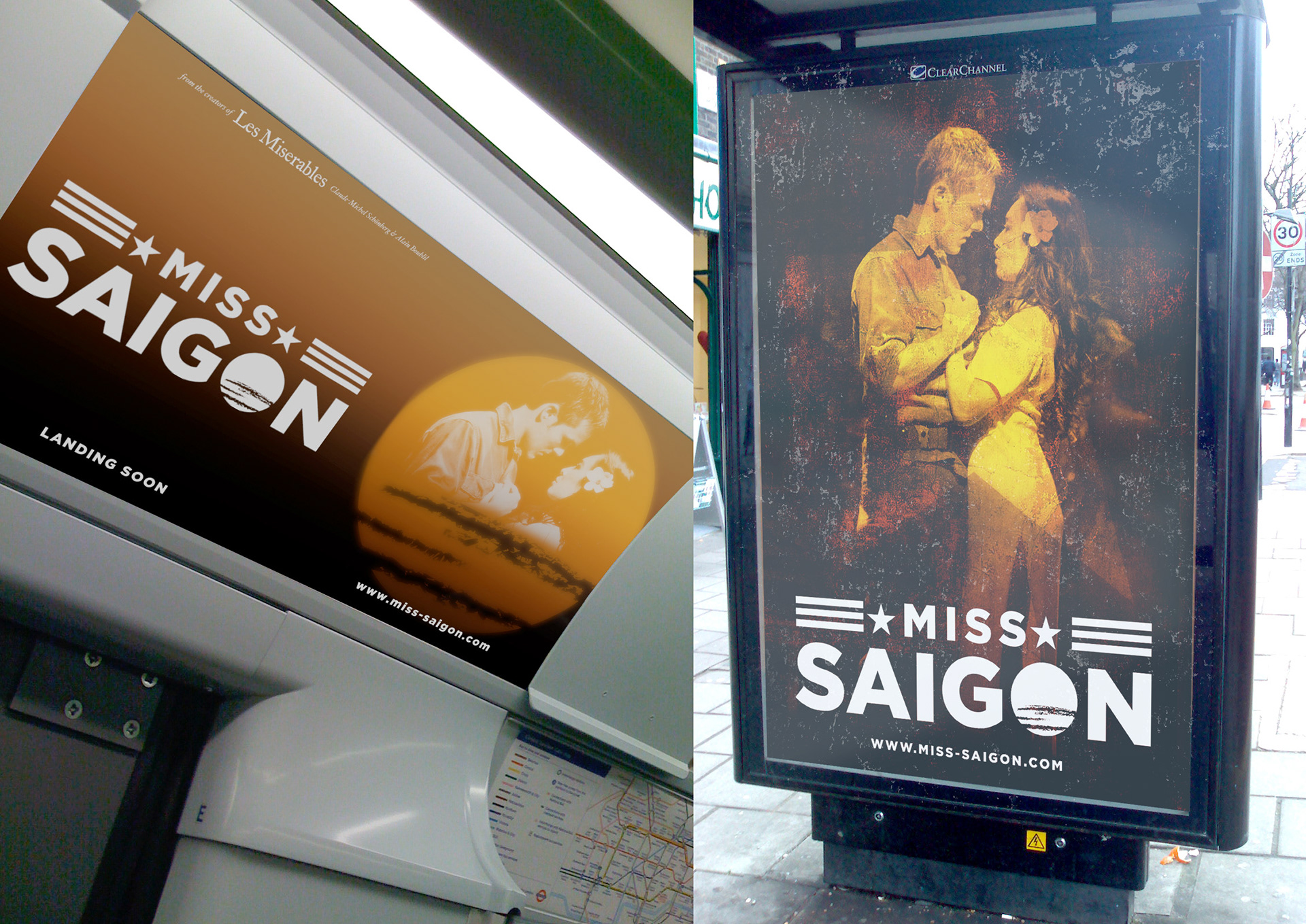
I wanted these to be a series of iconic, possibly letterpress, posters, post cards, advertisements. Bold, strong, brash - again the military theme coming through. But also a set, that could be collected.
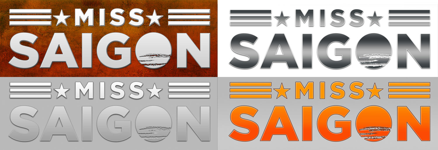
I tried a couple of treatments to the type just in my brainstorming phase. Simpler works best, but the orange gradient version did end up getting used in places where the white is too stark.
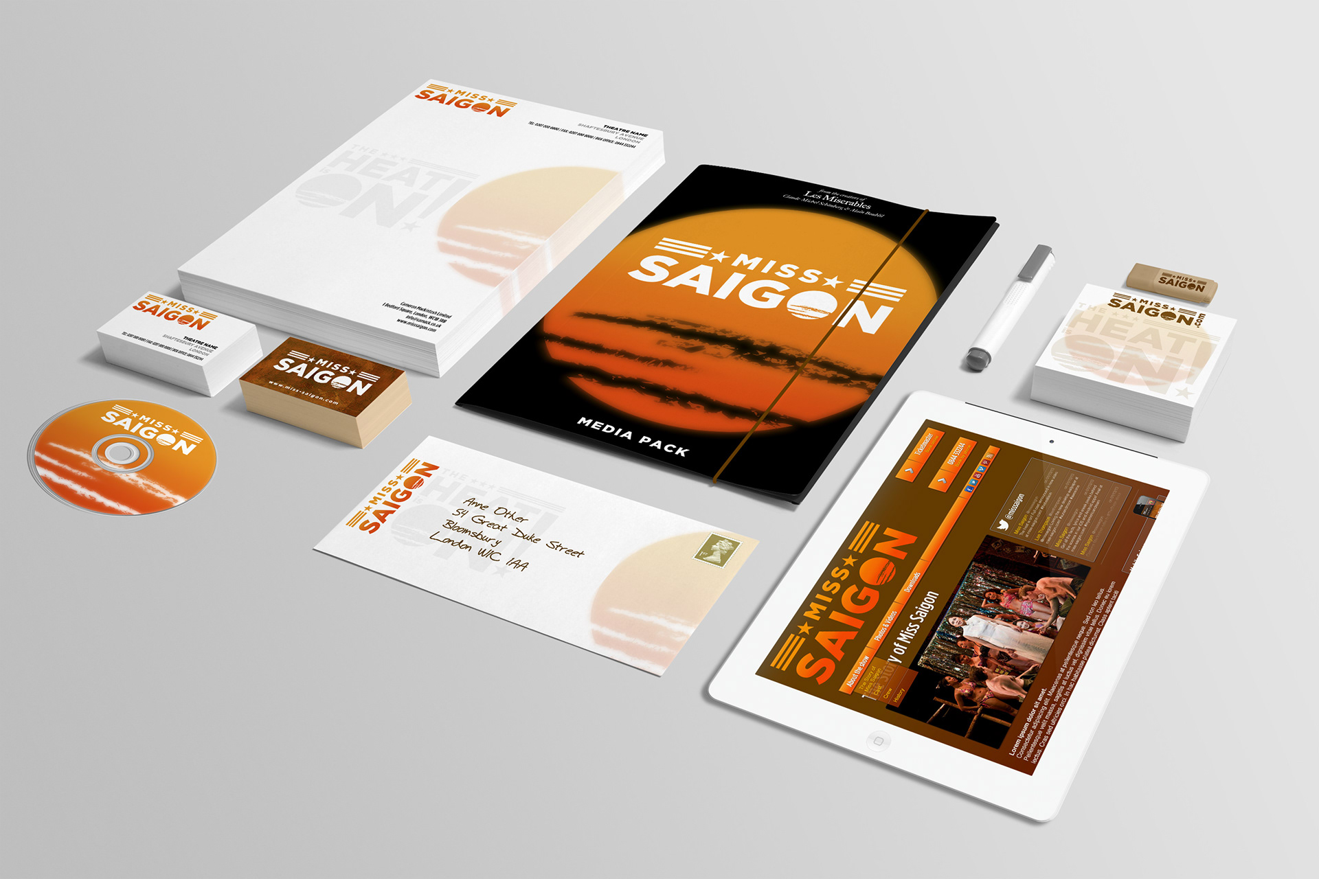
The media pack, because - well, why not?!

Using the simple elements of the sun, the bold text and the anchoring song lyrics, I put these simple ideas together.
Photo: Jacqueline Nguyen & Kevin Odekirk as Kim and Chris, from the La Mirada Theatre for the Performing Arts 2012 production. Photo by Michael Lamont.
Photo: Jacqueline Nguyen & Kevin Odekirk as Kim and Chris, from the La Mirada Theatre for the Performing Arts 2012 production. Photo by Michael Lamont.

Taking the anchor concept a stage further, and trying out some different cast photo treatments.
Centre photo: Ma-anne Dionisio as Kim and members of the ensemble. Dancap Productions, Toronto Four Seasons Centre for the Performing Arts 2010 production. Photo by Cheol Joon Baek
Right photo: Leo Valdez as the Engineer, on tour in either Manila, Hong Kong, Sydney or London.
Centre photo: Ma-anne Dionisio as Kim and members of the ensemble. Dancap Productions, Toronto Four Seasons Centre for the Performing Arts 2010 production. Photo by Cheol Joon Baek
Right photo: Leo Valdez as the Engineer, on tour in either Manila, Hong Kong, Sydney or London.
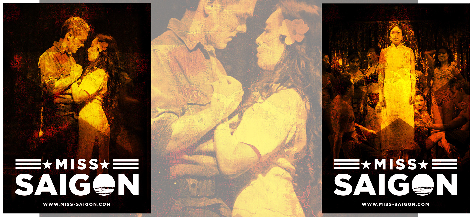
I wanted to try something with a bit more grit, some dirt, some angsty, rough-and-ready style. Reflecting the poor conditions in a war-ravaged nation, the brightening light of America (in the star device) and the focus on the key cast. these are some of my favourites.

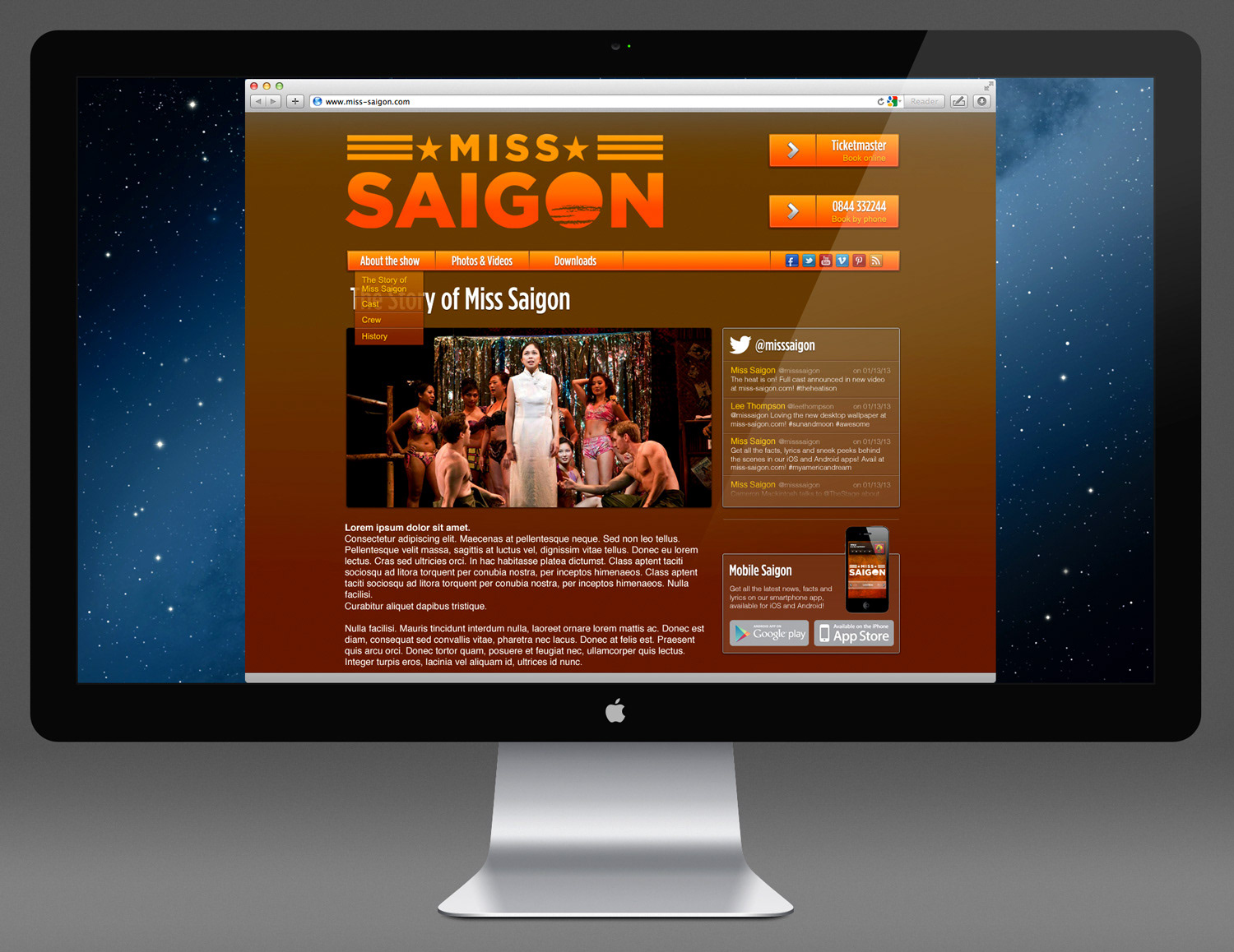
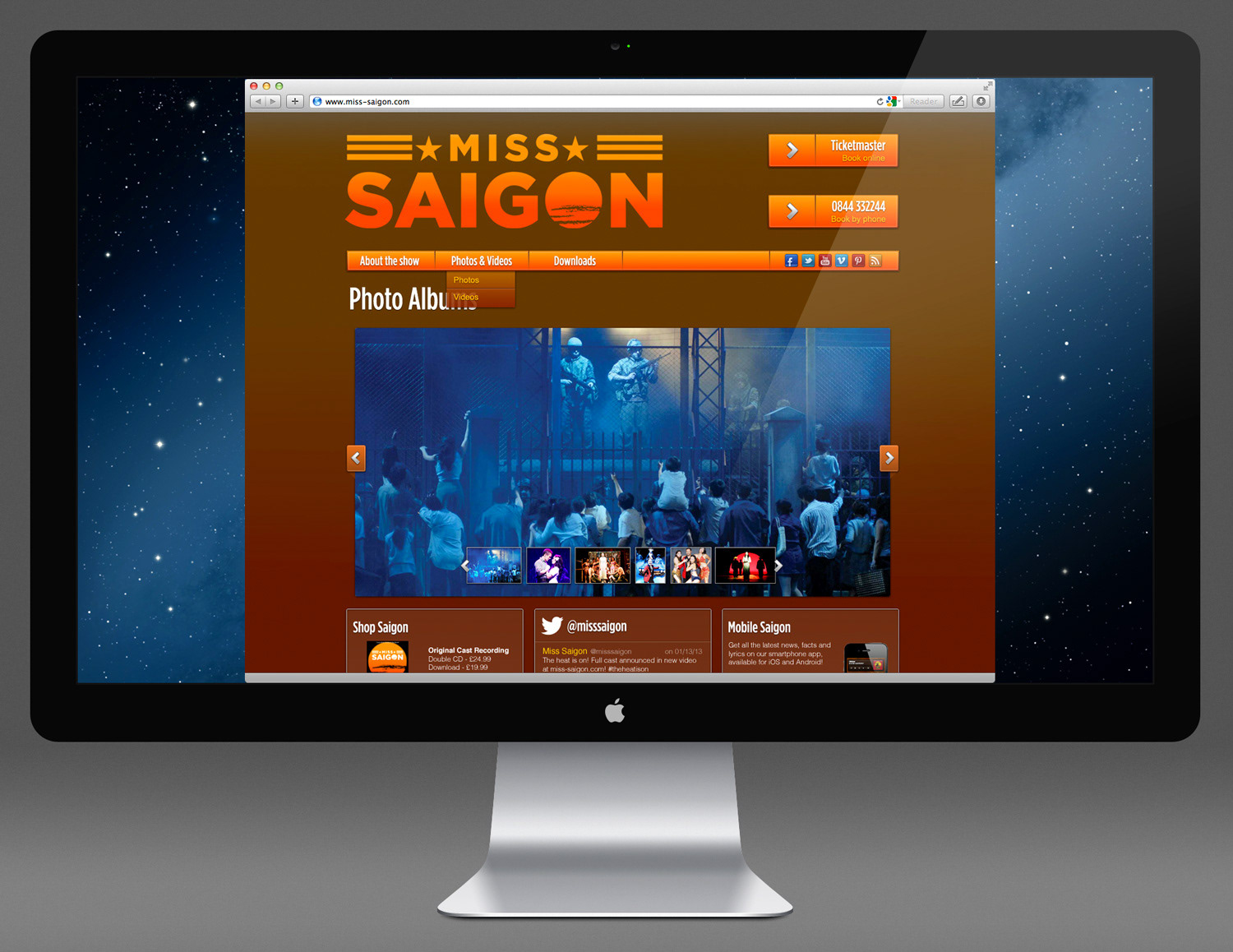
The web treatment - clean and simple, but pushing the brand as much as the show. Integrated twitter and social sharing options allow people to help get the word out on a grass roots level. Simple menu options keep the screen clear and put the focus on the content, and the purchasing options.

I wanted the colours to be natural, earthy, to allow the rich media elements of the photography and video to really pop out of the screen. The show is painted with so much beautiful light that it would be a shame to lose that on a busy, crowded website.
Photo - I've not been able to find details on this one. If you know it, let me know!
Photo - I've not been able to find details on this one. If you know it, let me know!

An app? Of course! Designed here so that it could either be presented in a native form to the platform, or designed as a rich-media HTML5 web app for multiple platforms.
With built-in samples of the soundtrack, a custom RSS feed reader for all the latest news, a photo gallery, and the full libretto all in your pocket. The lyrics in the show are so powerful at times, and I think everyone should know them!
With built-in samples of the soundtrack, a custom RSS feed reader for all the latest news, a photo gallery, and the full libretto all in your pocket. The lyrics in the show are so powerful at times, and I think everyone should know them!
Ah, lovely in-situ mockups. Source photos are mine.
Stick it on a screen. Shiney.
(NB: The photos of Miss Saigon performances used in the artwork were sourced from the web. Where possible, I've attributed them to the performance, performers and photographer. As this is purely concept work these will not be reproduced anywhere else, but if requested I will take them down.)